
Copper wall art for office spaces is one of the quickest ways to make a workspace feel warmer and more welcoming. Most offices lean on cool greys, white walls and glass. A single piece in copper, terracotta and burnt orange instantly adds colour, depth and a sense of calm energy – without looking cluttered or unprofessional.
In this guide you will find seven practical styling ideas, the wall colours and frames that suit copper, a simple sizing rule, and a printable terracotta print you can download and hang the same day.
On this page
Quick answer
Choose one large copper or terracotta abstract piece, hang it where people look first (behind the desk, reception or at the end of a corridor), and repeat its colour in one or two small accents such as a leather chair, a clay pot or a brass lamp. Keep the rest of the palette neutral.
By Dr. Mueed Akhtar, PhD (Chemical Engineering), founder of HawkInc · Last updated 13 October 2026
Key takeaways
- Copper softens hard office surfaces like glass, steel and white walls, and pairs well with wood and greenery.
- Pair copper with warm white, cream, sand, greige, soft clay, olive green or deep navy; avoid very cool, bright whites.
- Above a standard desk, 16×20 or 16×24 inches works well; go larger in reception areas and hallways.
- Use copper art as a video-call backdrop, to anchor a reception desk or to zone an open-plan space.
- Printable wall art, printed on good matte paper and framed well, is a low-cost way to refresh office walls.
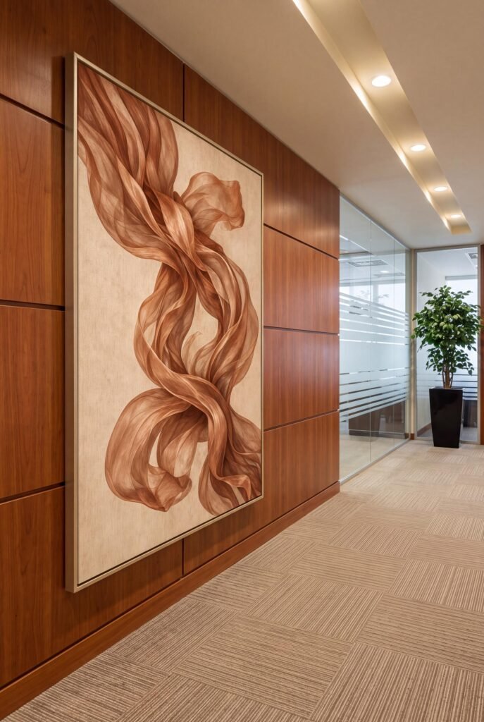
Why copper wall art for office spaces works so well
Colour affects how a room feels. According to research summarised in colour psychology, warm hues such as orange and red tend to feel energising and sociable, while cool tones feel calm and distant. Copper sits in a useful middle ground: warm enough to feel friendly, earthy enough to stay grown-up.
Copper also connects naturally with materials offices already have – walnut desks, leather chairs, brass fittings and plants. That makes it easier to style than bright primary colours.
- It warms up cold, grey or white rooms.
- It looks premium and pairs well with wood.
- It photographs beautifully on video calls.
- It suits both corporate and creative businesses.
7 copper and terracotta wall art ideas for your office
1. Make it the backdrop for video calls
Hang a vertical copper print directly behind your chair. It gives your calls a warm, polished background and hides a blank wall. A 16×24 print is large enough to read clearly on camera.
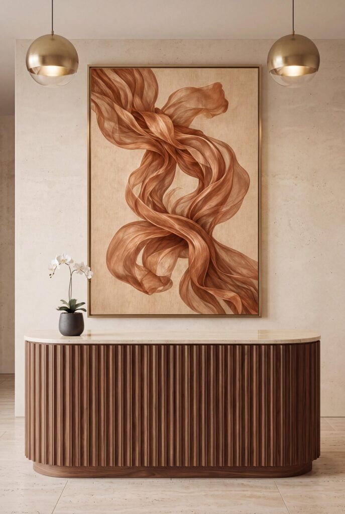
2. Anchor a reception desk
Reception is your first impression. A tall piece of terracotta wall art centred above a curved wood desk says “welcome” before anyone speaks. Add a small plant on one side for balance.
3. Finish a long corridor
Corridors feel endless without a focal point. Put a large print at the end of the hallway so people walk toward it. Warm colour visually pulls the far wall closer, making the space feel shorter and cosier.
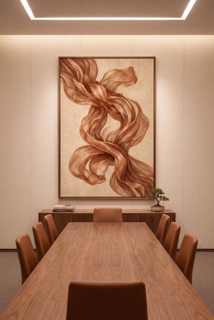
4. Soften a meeting room
Meeting rooms are often all glass and hard lines. A copper abstract with flowing, organic shapes softens the room and gives people something calm to look at during long discussions.
5. Warm up a home office desk wall
In a home office, hang the art low over the desk – about 8 to 10 inches above the desktop – so it feels connected to your workspace. Add a black desk lamp and a leafy plant for a crisp, modern look.
6. Use burnt orange wall art to zone an open-plan space
In open-plan offices, art helps define areas. A burnt orange piece can mark a lounge corner or break-out zone, while calmer blues or greens mark focus areas.
7. Repeat the colour in small accents
The easiest way to make copper look intentional is repetition. Pick up the tone in two or three small items – a leather chair, a clay vase, a copper pen pot – and the whole room feels designed.
Warm office decor ideas: colours that pair with copper
| Pair copper with… | The effect |
|---|---|
| Warm white or cream | Bright, clean and welcoming |
| Walnut and dark wood | Rich, executive and premium |
| Olive or sage green | Natural and calming |
| Deep navy | Confident contrast |
| Black metal | Modern and graphic |
How big should office wall art be?
A simple rule: art should be about two-thirds the width of the furniture beneath it. Hang it so the centre sits around 57–60 inches from the floor, or 8–10 inches above a desk or console.
- Above a desk: 16×20 or 16×24 inches
- Reception or corridor end: 16×32 or larger
- Small nook or shelf: 8×10 or 11×14 inches
- Narrow wall or column: 12×36 inches
Printable wall art vs original art for offices
Original paintings are wonderful but expensive and hard to change. High-resolution printable art costs a fraction of the price, can be printed in exactly the size you need, and is easy to refresh when you rebrand or move. Print it on matte paper at a local print shop and use a good frame, and most visitors will not know the difference.
How to print and frame printable wall art
Printable art only looks as good as the print. These simple steps give you gallery-quality results at a fraction of the cost of original art.
Choose the right paper
Matte or lightly textured papers – such as heavyweight matte photo paper or cotton rag – give soft, rich colour with no glare. Glossy paper can look cheap under bright lights and shows reflections in photos.
Print at a print shop for large sizes
A home inkjet is fine for 8×10 or 11×14 inches. For anything larger, a local print shop or online print service will give you better colour accuracy and sharper detail. Upload the PDF that matches your frame size so nothing gets cropped.
Pick a frame that suits the room
- Black: crisp and modern; works almost anywhere.
- Natural oak or walnut: warm, Japandi and mid century friendly.
- White: light, coastal and Scandinavian.
- Brass or gold: elegant and slightly glamorous.
Hang it at the right height
Centre the artwork about 57–60 inches from the floor – roughly eye level. Above furniture, leave 8–10 inches between the top of the sofa, bed or console and the bottom of the frame. Art that is about two-thirds of the width of the furniture below looks balanced.
Refresh with the seasons
Because printable art is affordable, you can swap prints when the seasons change or when you redecorate. Keep your files safe and reprint whenever you need a new size.
Shop the copper abstract wall art printable
The artwork featured in this guide is our copper abstract wall art printable: silky ribbons of copper, terracotta and burnt orange on a soft parchment background. You get a high-resolution JPG and print-ready PDFs in 10 vertical sizes, from 8×10 to 16×32 inches.
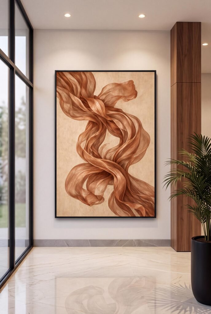
$7.99 · See full product details
Looking for a cooler palette? See our guide to navy blue office decor ideas, or browse all wall hangings.
Frequently asked questions
Is copper wall art good for an office?
Yes. Copper is warm and energising without being loud. It softens hard office surfaces like glass, steel and white walls, and pairs well with wood and greenery.
What wall colour goes with copper art?
Warm white, cream, sand, greige, soft clay, olive green and deep navy all make copper glow. Avoid very cool, bright whites if you want a cosy feel.
What size wall art for an office?
Aim for about two-thirds of the width of the furniture below it. Above a standard desk, 16×20 or 16×24 inches works well. In a hallway or reception, go larger.
Is printable wall art good enough for an office?
Yes, if you print high-resolution files on good matte paper at a print shop and frame them well. It is also far cheaper than original art, so you can refresh your walls more often.
What is the difference between copper and terracotta wall art?
Copper is a warm metallic orange-brown; terracotta is an earthy clay orange. Together they create a rich, grounded palette that feels welcoming in work spaces.