
These navy blue office decor ideas will help you create a workspace that feels calm, focused and quietly confident. Navy is a “dark neutral” – as versatile as grey, but with much more personality. Used well, it makes an office look established and trustworthy without feeling cold.
Quick answer: To decorate an office with navy blue, use it as the accent rather than the whole room: add a large navy wall art print, a navy chair or cabinet, then balance it with light walls, warm walnut or oak, brass accents and plants. Wall art is the easiest way to add navy without repainting.
By Dr. Mueed Akhtar, PhD (Chemical Engineering), founder of HawkInc · Last updated 13 October 2026
Key takeaways
- Navy is a “dark neutral”: calm, confident and less harsh than black, so it suits corporate and home offices.
- Keep ceilings and most walls light and use navy as the accent so the room never feels dark.
- Pair navy with white, pale grey, lavender, walnut, oak, brass, blush or green.
- Go big with art: 16×24 inches or larger on main walls, with a light background to keep the scheme from feeling heavy.
- Centre art 57–60 inches from the floor, or 8–10 inches above furniture.
Below are nine easy looks for home offices and workplaces, plus colour pairings, wall art sizing tips and a large abstract navy print you can download and hang today.
On this page
Why navy works in an office
Blue is widely associated with calm, stability and trust in colour psychology, which is one reason so many banks, law firms and tech brands use it. Navy adds depth and seriousness to that effect. It is also forgiving: it hides scuffs better than white and suits almost every wood tone.
9 navy blue office decor ideas
1. Start with navy blue wall art for office walls
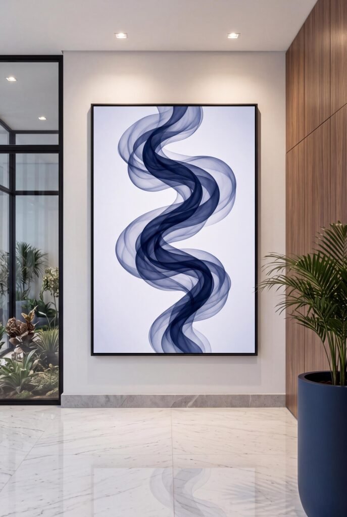
If you rent or do not want to repaint, art is the simplest way in. A large abstract in navy and indigo gives the room an instant colour story. Choose a print with a light background so it feels airy rather than heavy.
2. Pair navy with warm walnut
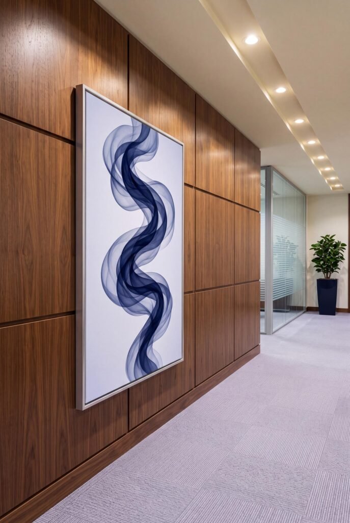
Walnut panelling and navy are a classic executive combination. The warm wood stops navy from feeling cold, and navy makes the wood look richer.
3. Add a navy reception desk or cabinet
A fluted navy reception desk or cabinet makes a strong first impression. Hang lighter art above it so the wall does not become a block of dark colour.
4. Try navy chairs in a meeting room
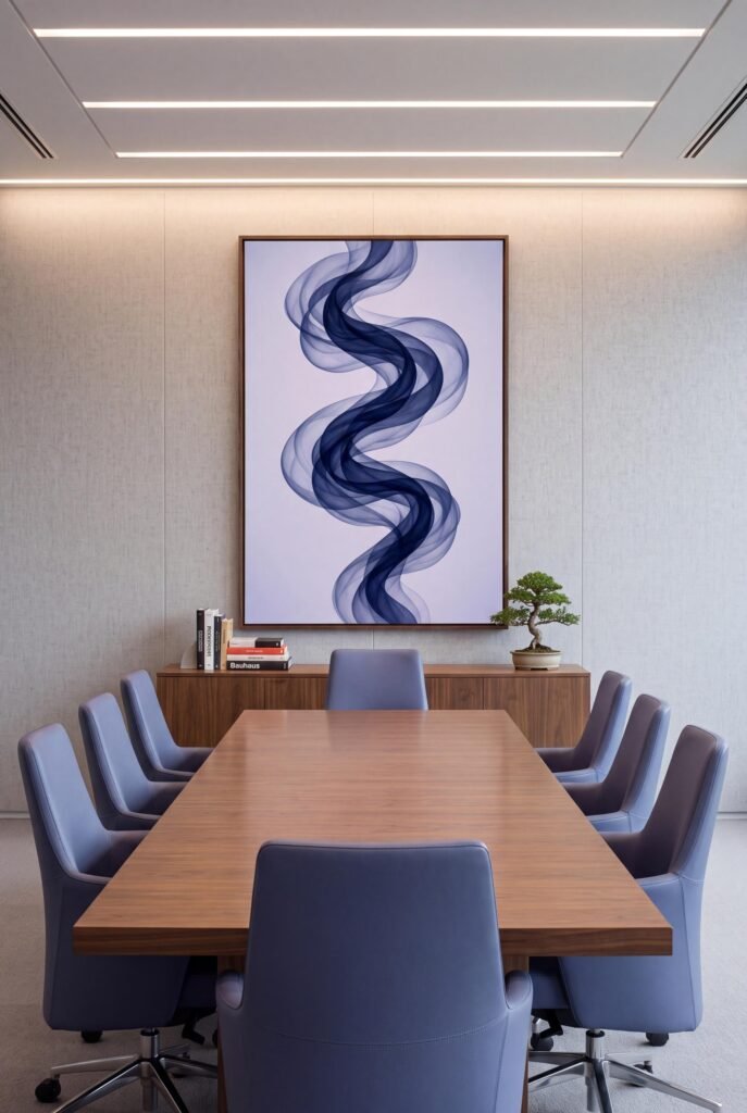
Upholstered navy chairs around a wooden table instantly feel premium. Add one piece of modern office wall art on the end wall to tie the room together.
5. Balance navy with pale lavender or grey
Soft lavender and pale grey are underrated partners for navy. They keep the palette cool and calm but add a subtle, modern softness.
6. Use brass and gold accents
Brass lamps, gold frames and handles make navy look polished and slightly luxurious – perfect for client-facing spaces.
7. Bring in plants
Green leaves look vivid against navy. A tall olive tree or snake plant beside a navy wall or artwork adds life and softens corners.
8. Create a navy home office corner
In a living room or bedroom, a navy rug, a navy desk chair and one navy print can carve out a “work zone” without building a separate room.
9. Keep it layered, not flat
Mix navy textures – velvet, linen, leather and matte paper prints – so the colour has depth. One flat navy shade everywhere can feel dull.
Navy office colour pairings
| Pair navy with… | Best for |
|---|---|
| White and pale grey | Clean, corporate offices |
| Walnut and brass | Executive and legal offices |
| Lavender and silver | Modern, creative studios |
| Green plants and oak | Wellbeing-focused workplaces |
| Blush and cream | Soft, welcoming home offices |
How to choose navy wall art for your office
- Go big: small art gets lost on office walls. Use 16×24 inches or larger for main walls.
- Pick movement: flowing, organic shapes feel calmer than hard geometric lines.
- Light background: keeps a navy scheme from feeling heavy.
- Right height: centre art at 57–60 inches, or 8–10 inches above furniture.
Common navy office mistakes to avoid
- Painting every wall navy in a small room with poor light.
- Using only cool white bulbs – choose warm white to balance the blue.
- Hanging tiny art on a large wall.
- Forgetting texture, so the room feels flat.
How to print and frame printable wall art
Printable art only looks as good as the print. These simple steps give you gallery-quality results at a fraction of the cost of original art.
Choose the right paper
Matte or lightly textured papers – such as heavyweight matte photo paper or cotton rag – give soft, rich colour with no glare. Glossy paper can look cheap under bright lights and shows reflections in photos.
Print at a print shop for large sizes
A home inkjet is fine for 8×10 or 11×14 inches. For anything larger, a local print shop or online print service will give you better colour accuracy and sharper detail. Upload the PDF that matches your frame size so nothing gets cropped.
Pick a frame that suits the room
- Black: crisp and modern; works almost anywhere.
- Natural oak or walnut: warm, Japandi and mid century friendly.
- White: light, coastal and Scandinavian.
- Brass or gold: elegant and slightly glamorous.
Hang it at the right height
Centre the artwork about 57–60 inches from the floor – roughly eye level. Above furniture, leave 8–10 inches between the top of the sofa, bed or console and the bottom of the frame. Art that is about two-thirds of the width of the furniture below looks balanced.
Refresh with the seasons
Because printable art is affordable, you can swap prints when the seasons change or when you redecorate. Keep your files safe and reprint whenever you need a new size.
Shop the navy blue wall art printable
The artwork in this guide is our navy blue wall art printable, Navy Pearl Penthouse: translucent indigo and navy ribbons on a pale lavender-white background. It comes as print-ready PDFs in 10 vertical sizes, from 8×10 up to 16×32 inches.

$5.99 · See full product details
Prefer a warmer look? Read copper wall art for office spaces, or browse all wall hangings.
Frequently asked questions
Is navy blue a good colour for an office?
Yes. Navy is calm, confident and professional. It is less harsh than black and works with wood, brass, white and grey, so it suits both corporate and home offices.
What colours go with navy blue in an office?
White, pale grey, lavender, walnut, oak, brass, blush and green all pair well with navy. Use a light colour on most surfaces and navy as the accent.
How do I add navy without painting the walls?
Use navy wall art, a navy rug, a velvet chair or navy storage. A large piece of navy blue wall art for office walls is the fastest, lowest-commitment option.
Will a navy office feel dark?
Not if you balance it. Keep ceilings and most walls light, add warm lighting, and choose art with a light background, like navy ribbons on pale lavender.
What size art should I hang in an office?
About two-thirds of the width of the desk or furniture below. For most desks, 16×20 or 16×24 inches is ideal; corridors and receptions can take larger panels.