
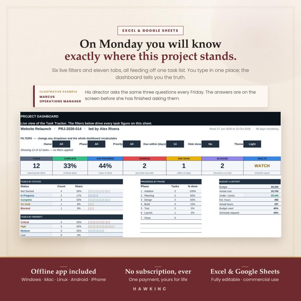
Quick answer: To build a project management dashboard in Excel or Google Sheets, keep one task table with owner, phase, start date, end date, status and percent complete. Then add a summary tab that counts tasks with COUNTIFS, flags overdue work with TODAY(), weights progress by duration, and draws a Gantt chart with conditional formatting. No add-ons are needed.
By Dr. Mueed Akhtar, PhD (Chemical Engineering), founder of HawkInc
Key takeaways
- A dashboard is only as good as the task table behind it: one row per task, one column per fact.
- Five numbers cover most small projects: tasks done, percent complete, overdue tasks, days remaining and budget used.
- Weight percent complete by task duration; a plain average flatters projects with lots of small finished tasks.
- A Gantt chart needs no add-on: one conditional formatting rule on a date grid draws every bar.
- Excel suits offline, single-owner work; Google Sheets suits teams editing together.
What should a project management dashboard include?
A project management dashboard should show, on one screen, how much work is done, what is late, what is coming next, who is overloaded and whether the budget is on track. Everything on it should be calculated from the task list, so nobody retypes numbers and the dashboard is always as current as the tracker.
Here is a practical checklist. If a tile does not change a decision, leave it off.
| Dashboard element | What it answers | Built from |
|---|---|---|
| Tasks done / total | How far through the list are we? | COUNTIFS on Status |
| Weighted percent complete | How much of the work, not the task count, is finished? | SUMPRODUCT of duration and % complete |
| Overdue tasks | What has slipped? | COUNTIFS on End date and Status |
| Working days remaining | How much runway is left? | NETWORKDAYS(TODAY(), project end) |
| Progress by phase | Which stage is behind? | AVERAGEIFS by Phase |
| Budget used | Are we spending faster than progressing? | SUM of actual cost / budget |
| Health status | Red, amber or green at a glance | IF rules on overdue and budget |
| Next milestones | What is due in the next 14 days? | FILTER or sorted milestone list |
How do you build a project management dashboard in Excel?
Build it in two layers: a task table that holds the facts and a dashboard tab that only contains formulas. Set the task table up as an Excel Table (Ctrl+T) so formulas expand automatically when you add rows. The same steps work in Google Sheets with ordinary ranges.
- Create a Lists tab. Type your phases, owners, priorities and statuses (Not started, In progress, Done) in columns. Use these with Data Validation so every entry is spelled the same way.
- Create the Tasks table. Columns: Task, Phase, Owner, Priority, Start, End, Duration, Status, % Complete, Budget, Actual. Duration can be
=NETWORKDAYS([@Start],[@End]). - Count progress. On the dashboard tab, tasks done is
=COUNTIFS(Tasks[Status],"Done")and total is=ROWS(Tasks[Task]). - Weight percent complete. Use
=SUMPRODUCT(Tasks[Duration],Tasks[% Complete])/SUM(Tasks[Duration])and format it as a percentage. - Flag overdue work. Use
=COUNTIFS(Tasks[End],"<"&TODAY(),Tasks[Status],"<>Done"). - Show runway. Working days left is
=NETWORKDAYS(TODAY(),MAX(Tasks[End])). - Add a health rule. For example
=IF(OR(overdue>2,budget_used>pct_complete+0.15),"Red",IF(overdue>0,"Amber","Green")), then colour the cell with conditional formatting. - Chart progress by phase. List phases, use AVERAGEIFS for each, and insert a bar chart.
Microsoft documents how NETWORKDAYS counts working days, including an optional holiday list you can add to the Lists tab.
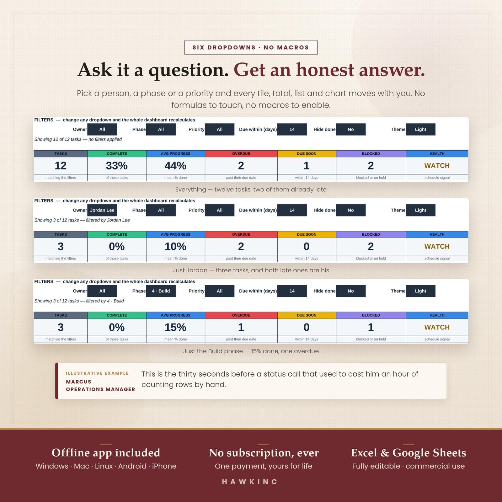
Skip the build: The HawkInc Project Management Dashboard gives you this whole setup already wired up: 11 linked tabs, an automatic Gantt chart, RAID log, workload sheet, offline app and printable pages. USD 4.19 on Etsy (regular USD 6.99).
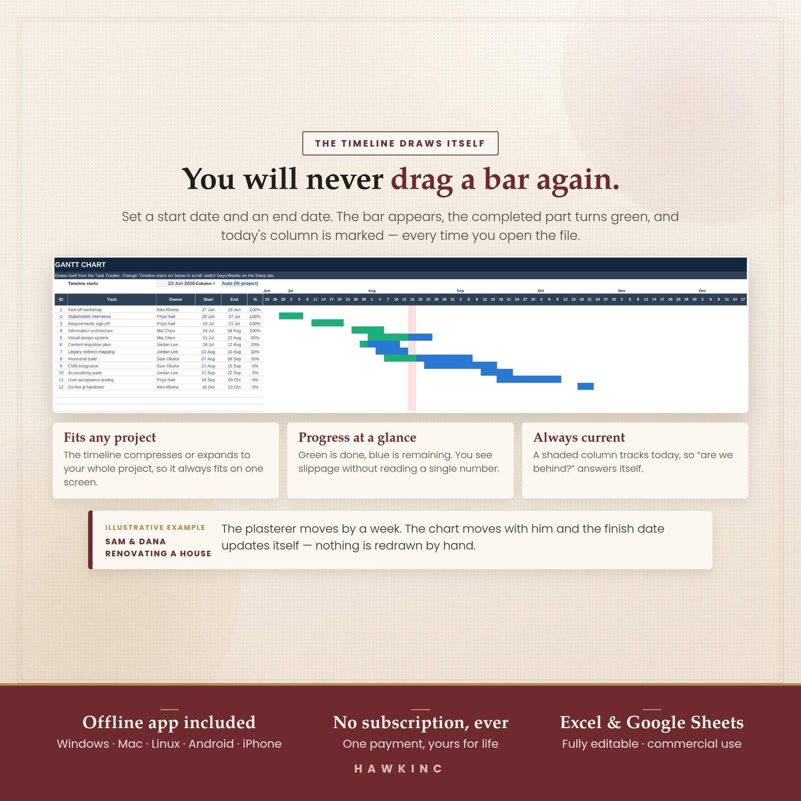
How do you make a Gantt chart in Excel or Google Sheets without add-ons?
The simplest Gantt chart is a grid: tasks down the side, one column per day or week across the top, and one conditional formatting rule that colours a cell when its date falls between the task start and end. Change a date in the tracker and the bar moves on its own, so you never drag bars.
- On a new tab, pull task names, Start and End into columns A to C.
- In row 4 from column E, put the first date, then
=E4+1(daily) or=E4+7(weekly) across. - Select the grid from E5 and add a conditional formatting rule with the custom formula
=AND(E$4>=$B5,E$4<=$C5). - Add a second rule with a lighter colour for today:
=E$4=TODAY().
Excel also has a chart-based method using a stacked bar chart, explained in Microsoft’s guide to presenting data in a Gantt chart. In Google Sheets, custom formulas work the same way; see Google’s help on conditional formatting rules. For a quick in-cell progress bar in Sheets, try =SPARKLINE(I5,{"charttype","bar";"max",1}).
Excel or Google Sheets: which is better for a project dashboard?
Choose Excel if you work mostly alone, offline or with large files, and Google Sheets if several people need to update tasks at the same time from different places. The formulas in this guide work in both, so you can start in one and move later without rebuilding the logic.
| Need | Excel | Google Sheets |
|---|---|---|
| Cost | Part of Microsoft 365 | Free with a Google account |
| Offline work | Full | Limited (offline mode must be enabled) |
| Real-time team editing | Via OneDrive or SharePoint | Built in |
| Tables that auto-expand | Yes (Ctrl+T) | Use whole-column ranges or Tables |
| In-cell progress bars | Data bars | SPARKLINE |
| Best for | Solo owners, big workbooks | Small distributed teams |
Worked example: a six-task website project
Here is a small website redesign as it would sit in the task table, part way through week three. It shows why weighting by duration matters.
| Task | Duration (working days) | % complete | Duration × % done |
|---|---|---|---|
| Brief and sitemap | 3 | 100% | 3.0 |
| Wireframes | 5 | 100% | 5.0 |
| Visual design | 6 | 50% | 3.0 |
| Content writing | 8 | 25% | 2.0 |
| Build pages | 10 | 0% | 0.0 |
| Testing | 4 | 0% | 0.0 |
| Total | 36 | 13.0 |
- Simple average of the percent column: (100 + 100 + 50 + 25 + 0 + 0) ÷ 6 = 46%.
- Weighted percent complete: 13.0 ÷ 36 = 36%.
- Overdue: content writing was due last Friday and is not done, so overdue = 1 and health shows Amber.
The ten points of difference come from the two long tasks that have not started. A client looking at 46% would expect launch sooner than the work allows; 36% sets a more honest expectation.
Which risks and workload checks belong next to the dashboard?
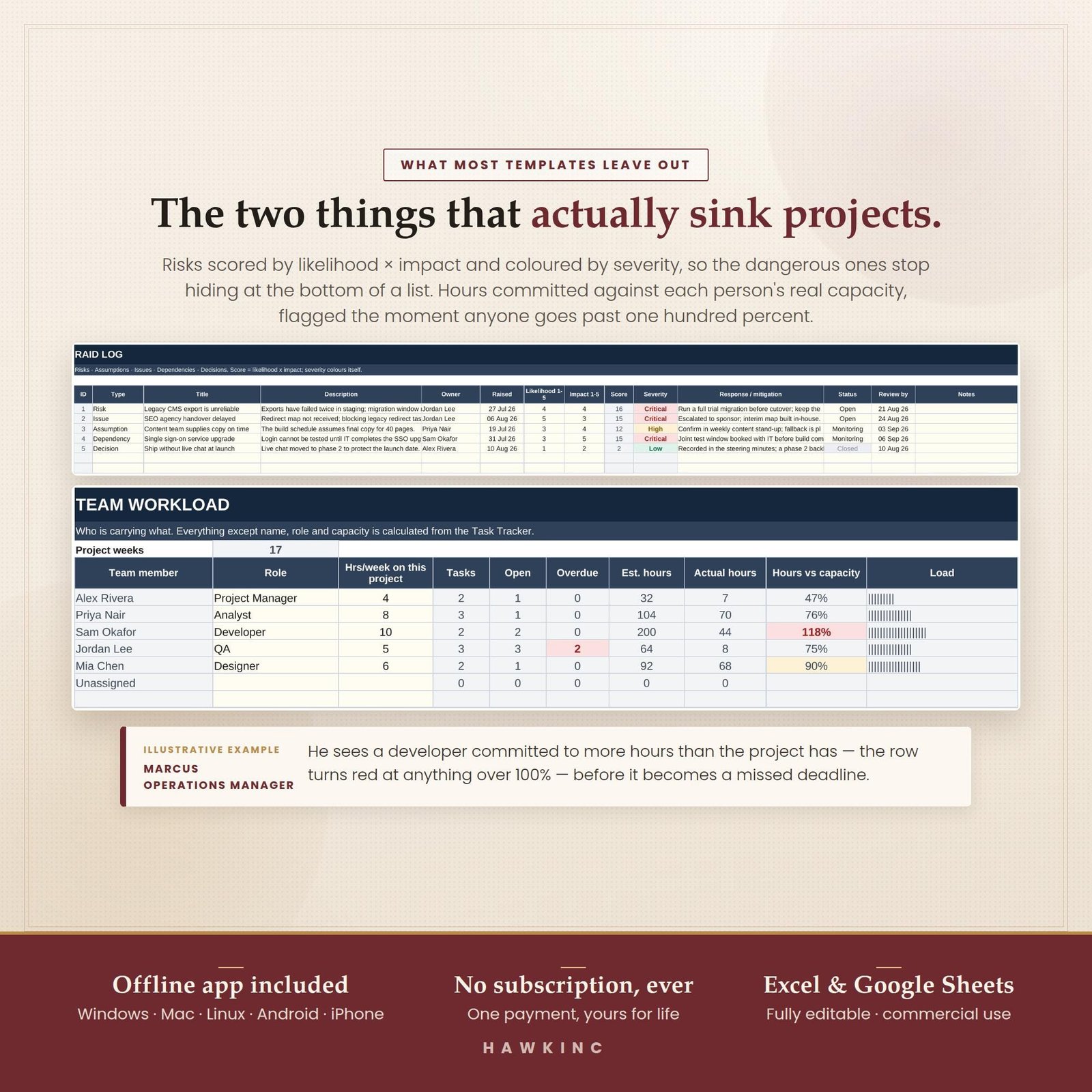
Add a RAID log and a workload sheet. Most small projects slip because of an unrecorded risk or one overloaded person, not because a task list was missing. A RAID log records risks, assumptions, issues and dependencies with an owner each; a workload sheet sums assigned hours per person against their weekly capacity.
- Workload per person:
=SUMIFS(Tasks[Hours],Tasks[Owner],A2)compared with their capacity in the next column. - Highlight anyone over 100% capacity in red with conditional formatting.
- Review open RAID items in the same weekly meeting as the dashboard, so they get an owner and a date.
If you need a quick sense check on how long a piece of work might take before you enter durations, try the free How long would it take? calculator. If you track personal routines in spreadsheets too, the same COUNTIFS approach powers our guide to a habit tracker in Google Sheets with automatic streaks. More templates live in the productivity hub.
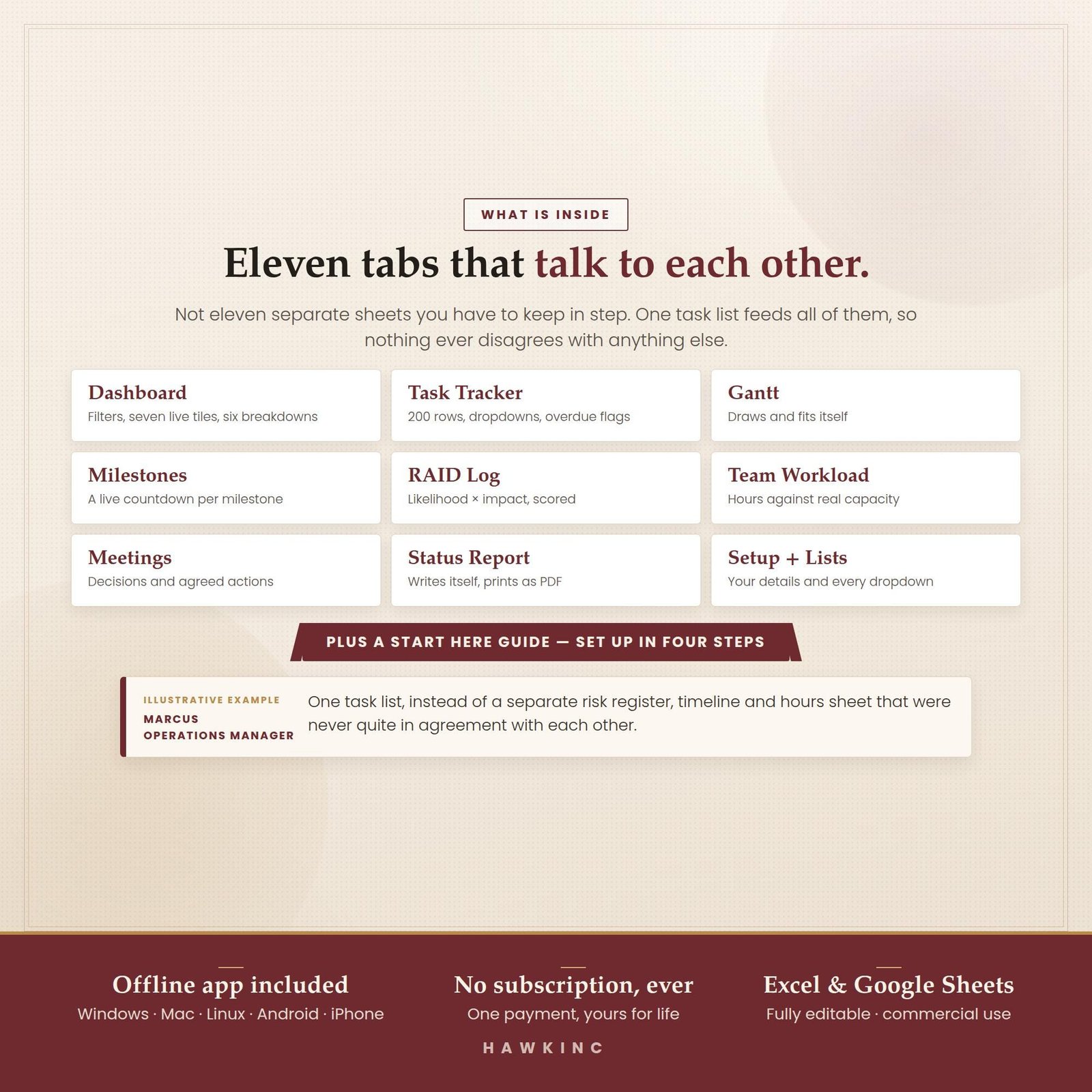
Want it ready-made? The HawkInc Project Management Dashboard gives you this whole setup already wired up: 11 linked tabs, an automatic Gantt chart, RAID log, workload sheet, offline app and printable pages. USD 4.19 on Etsy (regular USD 6.99).
Frequently asked questions
Can I make a project management dashboard in Excel for free?
Yes. Excel and Google Sheets already have everything you need: tables, COUNTIFS, NETWORKDAYS, conditional formatting and charts. Google Sheets is free with a Google account. Building one from scratch takes a few hours; a ready-made template saves that time but is optional.
What is the difference between a project tracker and a project dashboard?
A tracker is the list where you record every task, owner, date and status. A dashboard is the summary screen that reads the tracker and shows totals, percentages, overdue counts and charts. You update the tracker; the dashboard updates itself from it.
How do I show percent complete for a whole project?
Give each task a duration and a percent complete, then divide the sum of duration multiplied by percent complete by the total duration. In Excel that is SUMPRODUCT of the two columns divided by SUM of durations. It is more honest than a plain average because long tasks count for more.
What is a RAID log in project management?
RAID stands for risks, assumptions, issues and dependencies. It is a simple table where each row records one item, who owns it, how serious it is and what is being done. Keeping it next to your task tracker means problems are written down before they turn into missed deadlines.
How often should I update a project dashboard?
For most small projects, update task statuses whenever work changes and review the dashboard once a week before sending a status note. Because the dashboard is formula-driven, the weekly review is about reading it and acting on overdue or red items, not retyping numbers.
Can several people edit the same project dashboard?
In Google Sheets, yes: share the file and everyone edits the same copy in real time. In Excel, store the workbook in OneDrive or SharePoint to co-author it. Agree that only one person edits the setup lists, so phase and owner names stay consistent.